Tutorial
Welcome to ktplotspy! This is a python library to help visualise CellPhoneDB results, ported from the original ktplots R package (which still has several other visualisation options). Here, we will go through a quick tutorial on how to use the functions in this package.
Import libraries
[1]:
import anndata as ad
import pandas as pd
import ktplotspy as kpy
import matplotlib.pyplot as plt

from pathlib import Path
Prepare input
We will need 3 files to use this package, the h5ad file used for CellPhoneDB,the means.txt, pvalues.txt. deconvoluted.txt is only used for plot_cpdb_chord.
[2]:
# read in the files
# 1) .h5ad file used for performing CellPhoneDB
DATADIR = Path("../../data/")

adata = ad.read_h5ad(DATADIR / "kidneyimmune.h5ad")

# 2) output from CellPhoneDB
means = pd.read_csv(DATADIR / "out" / "means.txt", sep="\t")
pvals = pd.read_csv(DATADIR / "out" / "pvalues.txt", sep="\t")
decon = pd.read_csv(DATADIR / "out" / "deconvoluted.txt", sep="\t")
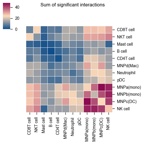
Heatmap
The original heatmap plot from CellPhoneDB can be achieved with this reimplemented function.
[3]:
kpy.plot_cpdb_heatmap(pvals=pvals, figsize=(5, 5), title="Sum of significant interactions")
[3]:
<seaborn.matrix.ClusterGrid at 0x775822c27b00>
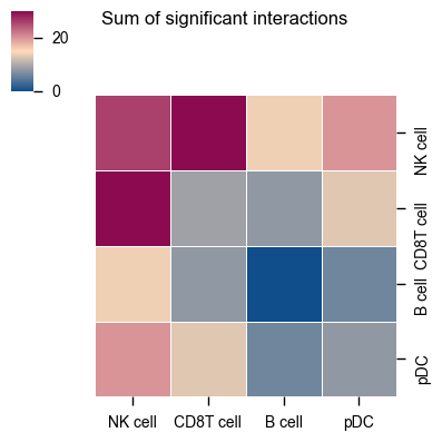
You can also specify specific celltypes to plot.
[4]:
kpy.plot_cpdb_heatmap(
    pvals=pvals, cell_types=["NK cell", "pDC", "B cell", "CD8T cell"], figsize=(4, 4), title="Sum of significant interactions"
)
[4]:
<seaborn.matrix.ClusterGrid at 0x77580edaafc0>
The current heatmap is directional (check count_network and interaction_edges for more details in return_tables = True).
To obtain the heatmap where the interaction counts are not symmetrical, do:
[5]:
kpy.plot_cpdb_heatmap(
    pvals=pvals,
    figsize=(5, 5),
    title="Sum of significant interactions",
    symmetrical=False,
)
[5]:
<seaborn.matrix.ClusterGrid at 0x77580cb560f0>
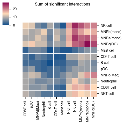
The values for the symmetrical=False mode follow the direction of the L-R direction where it’s always moleculeA:celltypeA -> moleculeB:celltypeB.
Therefore, if you trace on the x-axis for celltype A [MNPa(mono)] to celltype B [CD8T cell] on the y-axis:
A -> B is 18 interactions
Whereas if you trace on the y-axis for celltype A [MNPa(mono)] to celltype B [CD8T cell] on the x-axis:
A -> B is 9 interactions
symmetrical=True mode will return 18+9 = 27
Dot plot
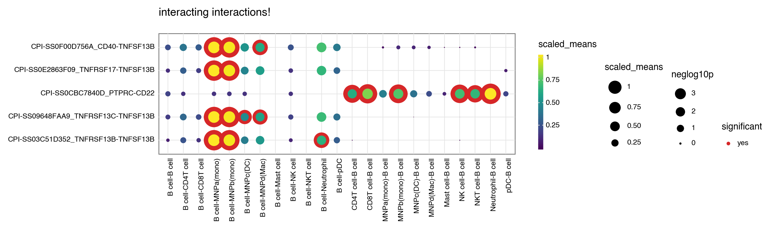
A simple usage of plot_cpdb is like as follows:
[6]:
# TODO: How to specify the default plot resolution??
kpy.plot_cpdb(
    adata=adata,
    cell_type1="B cell",
    cell_type2=".",  # this means all cell-types
    means=means,
    pvals=pvals,
    celltype_key="celltype",
    genes=["PTPRC", "TNFSF13B"],
    figsize=(13, 4),
    title="interacting interactions!",
)
[6]:
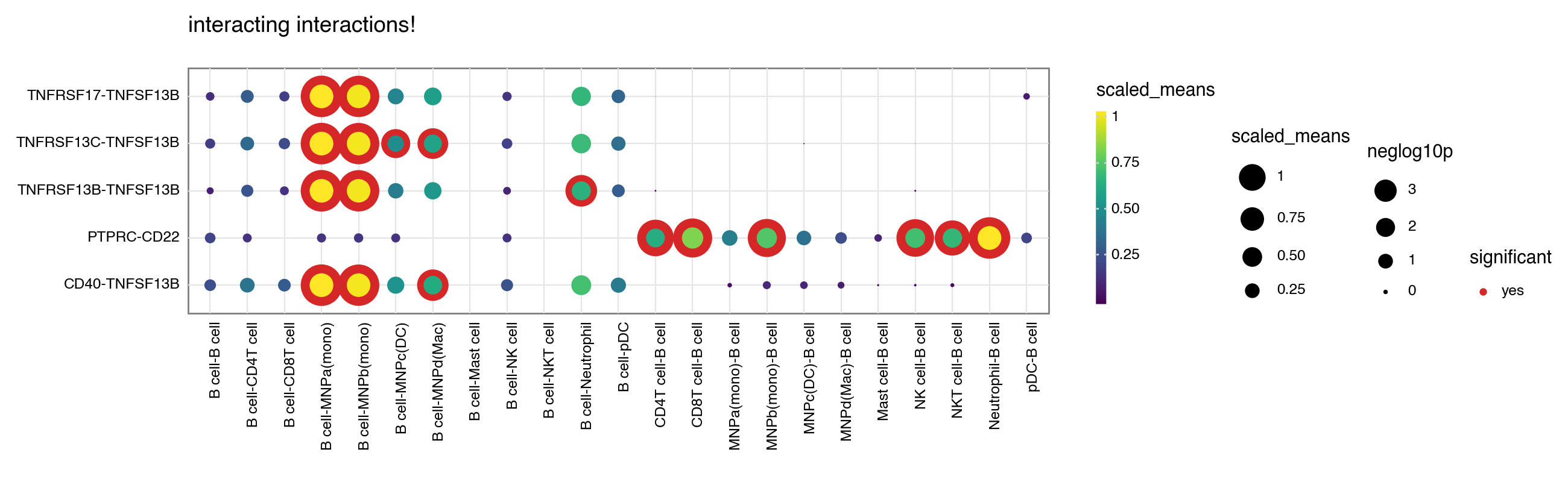
You can toggle keep_id_cp_interaction to keep the original interaction id. This is useful when there are duplicate interaction names (from cellphonedb V5 onwards).
[7]:
kpy.plot_cpdb(
    adata=adata,
    cell_type1="B cell",
    cell_type2=".",  # this means all cell-types
    means=means,
    pvals=pvals,
    celltype_key="celltype",
    genes=["PTPRC", "TNFSF13B"],
    figsize=(13, 4),
    title="interacting interactions!",
    keep_id_cp_interaction=True,
)
[7]:
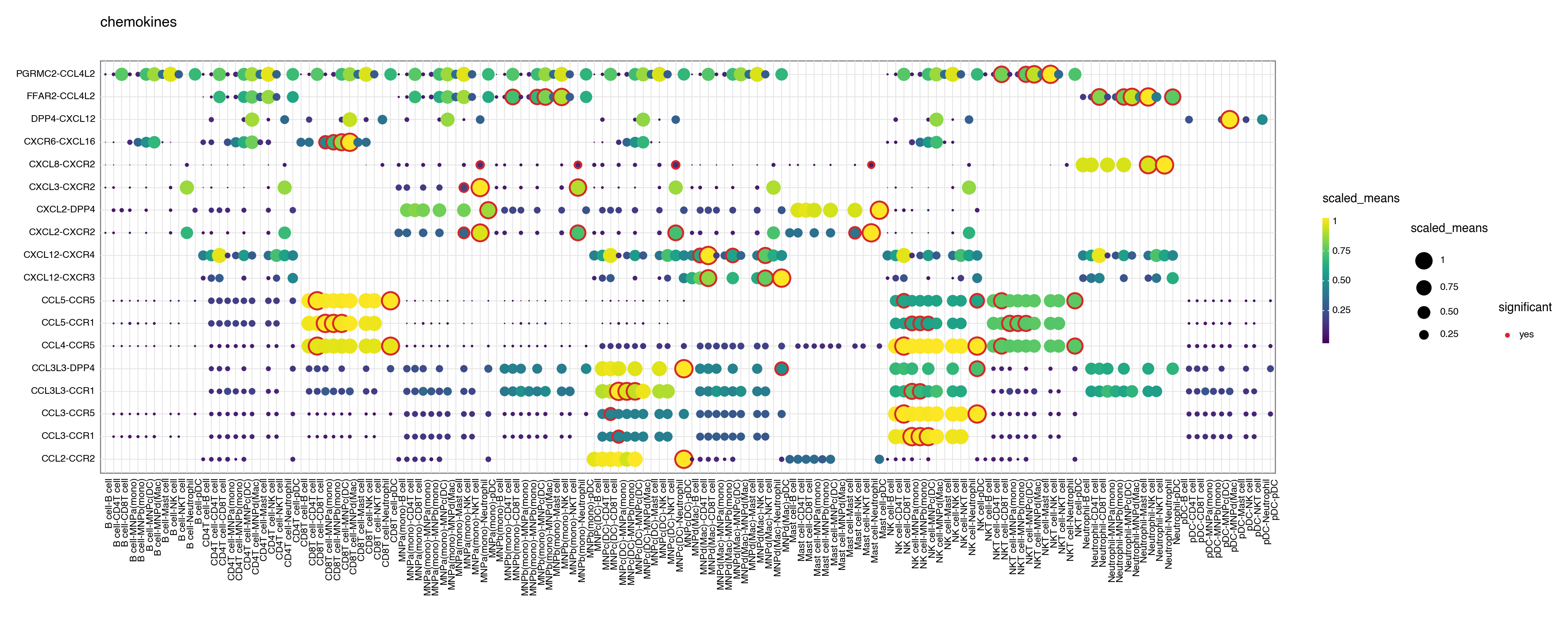
You can also specify a gene_family.
[8]:
kpy.plot_cpdb(
    adata=adata,
    cell_type1=".",
    cell_type2=".",
    means=means,
    pvals=pvals,
    celltype_key="celltype",
    gene_family="chemokines",
    highlight_size=1,
    figsize=(20, 8),
)
[8]:
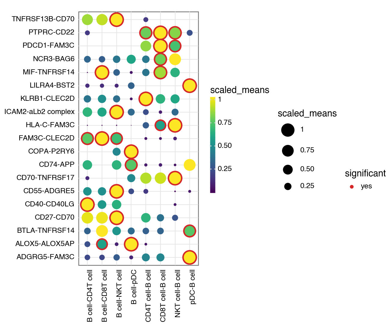
Or don’t specify either and it will try to plot all significant interactions.
[9]:
kpy.plot_cpdb(
    adata=adata,
    cell_type1="B cell",
    cell_type2="pDC|T",
    means=means,
    pvals=pvals,
    celltype_key="celltype",
    highlight_size=1,
    figsize=(6.5, 5.5),
)
[9]:
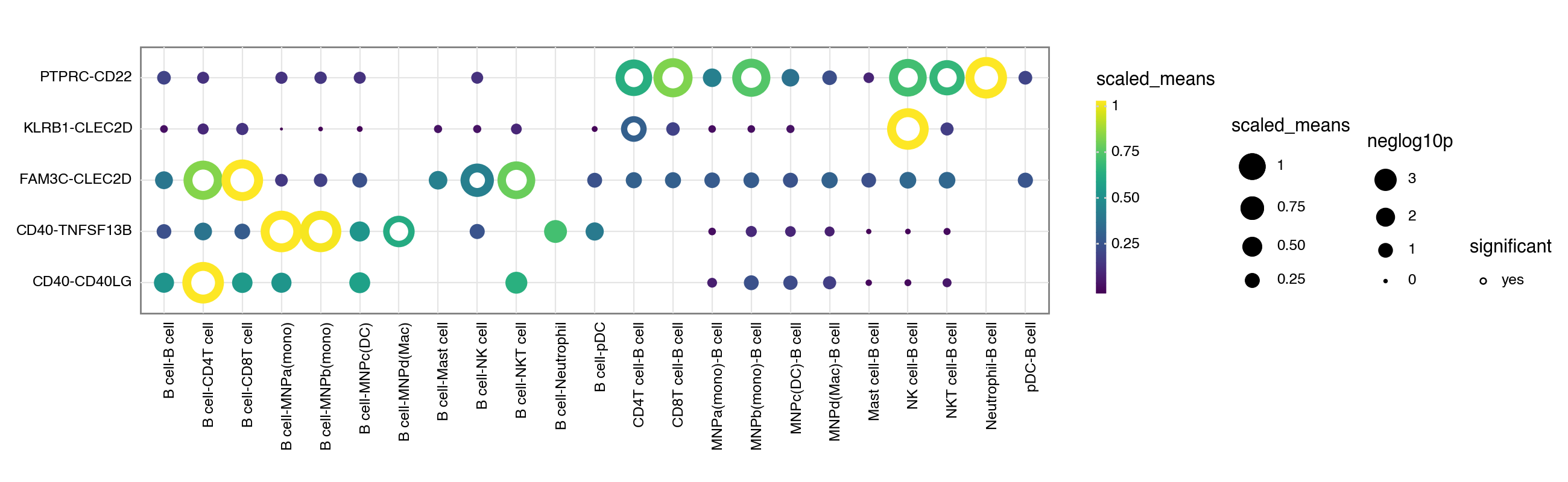
If you prefer, you can also use the squidpy inspired plotting style:
[10]:
kpy.plot_cpdb(
    adata=adata,
    cell_type1="B cell",
    cell_type2=".",
    means=means,
    pvals=pvals,
    celltype_key="celltype",
    genes=["PTPRC", "CD40", "CLEC2D"],
    default_style=False,
    figsize=(13, 4),
)
[10]:
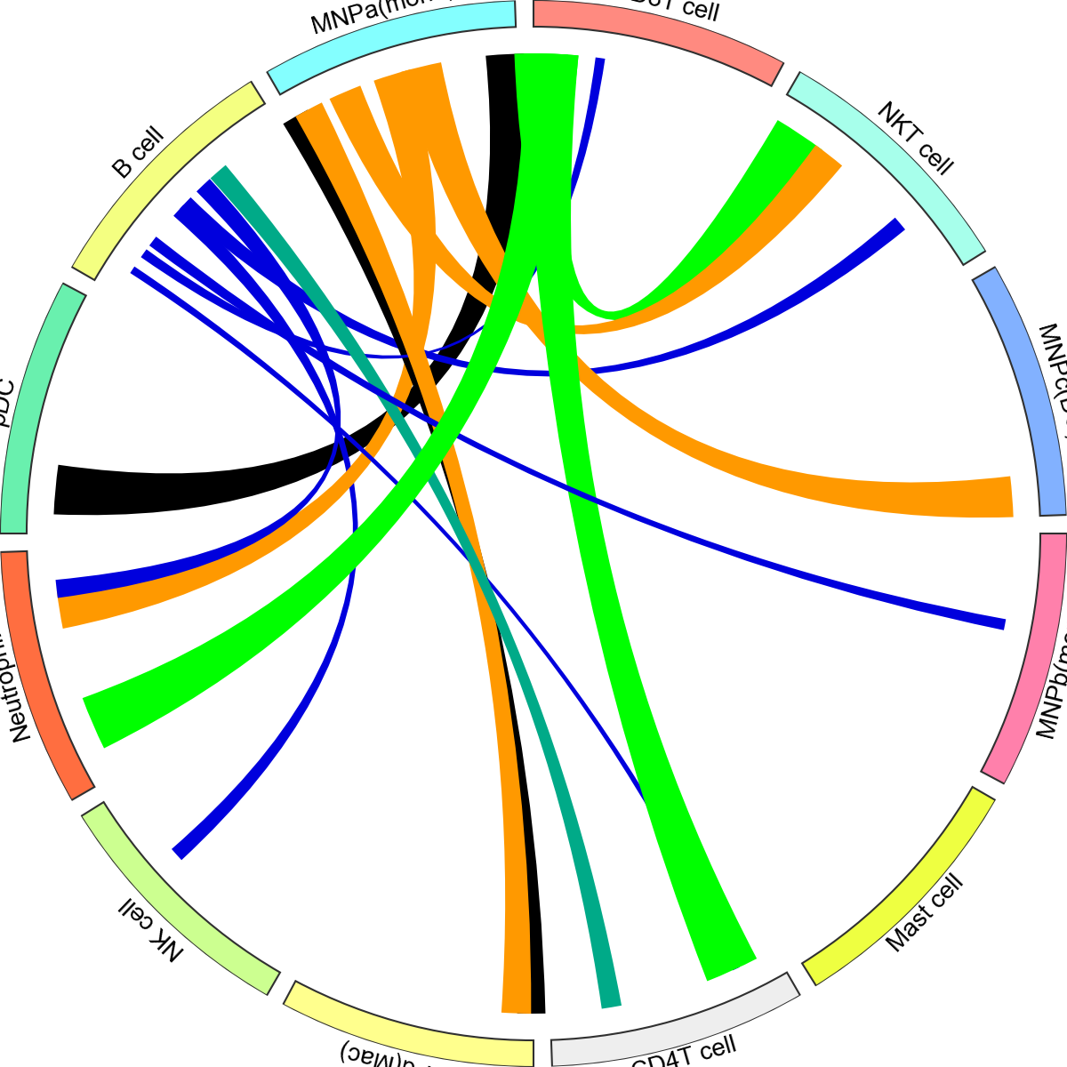
Chord diagram
There is a re-implementation of a circos/chord diagram by leveraging on the pyCirclize package.
[11]:
kpy.plot_cpdb_chord(
    adata=adata,
    cell_type1="B cell",
    cell_type2=".",
    means=means,
    pvals=pvals,
    deconvoluted=decon,
    celltype_key="celltype",
    interaction=["PTPRC", "CD40", "CLEC2D"],
    link_kwargs={"direction": 1, "allow_twist": True, "r1": 95, "r2": 90},
    sector_text_kwargs={"color": "black", "size": 12, "r": 105, "adjust_rotation": True},
    legend_kwargs={"loc": "center", "bbox_to_anchor": (1, 1), "fontsize": 8},
    link_offset=1,
)
[11]:
<pycirclize.circos.Circos at 0x77580c0632c0>
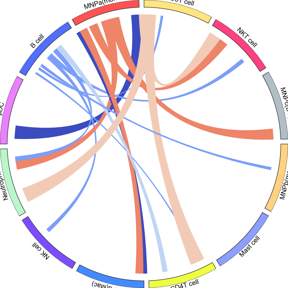
Colour of links can be made to be the same as the celltype.
[12]:
kpy.plot_cpdb_chord(
    adata=adata,
    cell_type1="B cell",
    cell_type2=".",
    means=means,
    pvals=pvals,
    deconvoluted=decon,
    celltype_key="celltype",
    interaction=["PTPRC", "CD40", "CLEC2D"],
    link_kwargs={"direction": 1, "allow_twist": True, "r1": 90, "r2": 90},
    sector_text_kwargs={"color": "black", "size": 12, "r": 105, "adjust_rotation": True},
    legend_kwargs={"loc": "center", "bbox_to_anchor": (1, 1), "fontsize": 8},
    link_offset=1,
    same_producer_colors=True,
)
[12]:
<pycirclize.circos.Circos at 0x775808c8fe60>
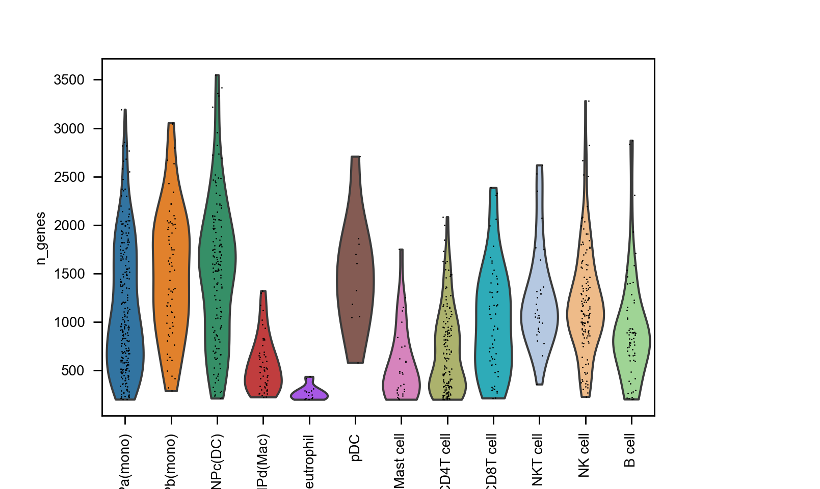
If your adata already has e.g. adata.uns['celltype_colors'], it will retrieve the sector_colours correctly:
[13]:
import scanpy as sc

sc.pl.violin(adata, ["n_genes"], groupby="celltype", rotation=90)
kpy.plot_cpdb_chord(
    adata=adata,
    cell_type1="B cell",
    cell_type2=".",
    means=means,
    pvals=pvals,
    deconvoluted=decon,
    celltype_key="celltype",
    interaction=["PTPRC", "CD40", "CLEC2D"],
    same_producer_colors=True,
    link_kwargs={"direction": 1, "allow_twist": True},
    sector_text_kwargs={"color": "black", "size": 12, "r": 105, "adjust_rotation": True},
    legend_kwargs={"loc": "center", "bbox_to_anchor": (1, 1), "fontsize": 8},
)
[13]:
<pycirclize.circos.Circos at 0x77580c365370>
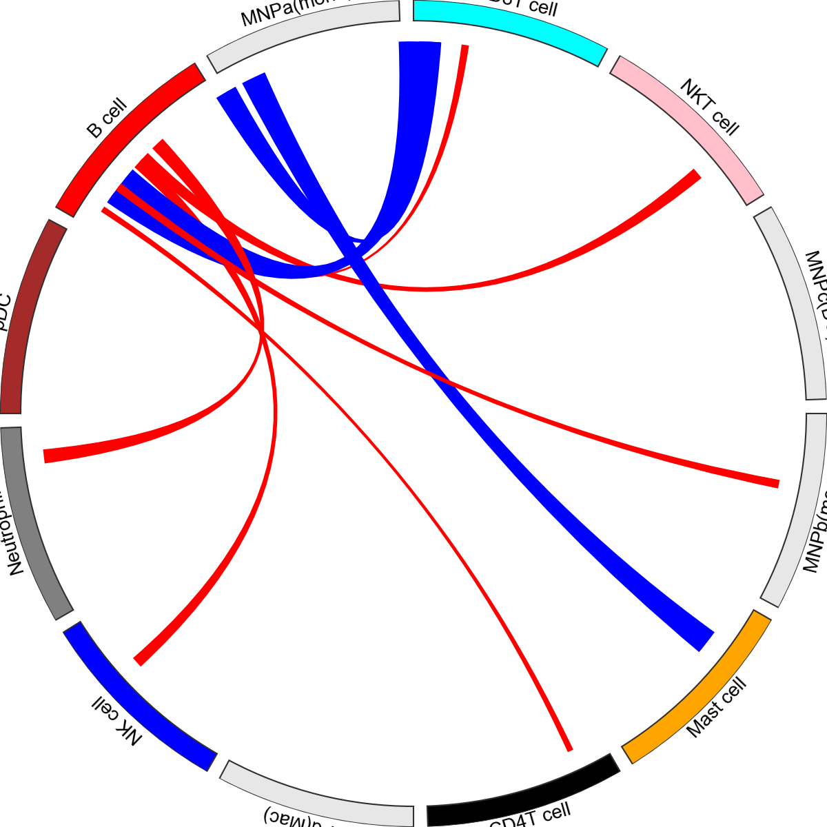
You can also provide dictionaries to change the colours for both sectors and links.
[14]:
kpy.plot_cpdb_chord(
    adata=adata,
    cell_type1="B cell",
    cell_type2=".",
    means=means,
    pvals=pvals,
    deconvoluted=decon,
    celltype_key="celltype",
    interaction=["PTPRC", "TNFSF13B", "BMPR2"],
    sector_colors={
        "B cell": "red",
        "NK cell": "blue",
        "CD4T cell": "black",
        "pDC": "brown",
        "Neutrophil": "grey",
        "Mast cell": "orange",
        "NKT cell": "pink",
        "CD8T cell": "cyan",
    },
    link_colors={"CD22-PTPRC": "red", "TNFSF13B-TNFRSF13B": "blue"},
)
[14]:
<pycirclize.circos.Circos at 0x77580353f6b0>
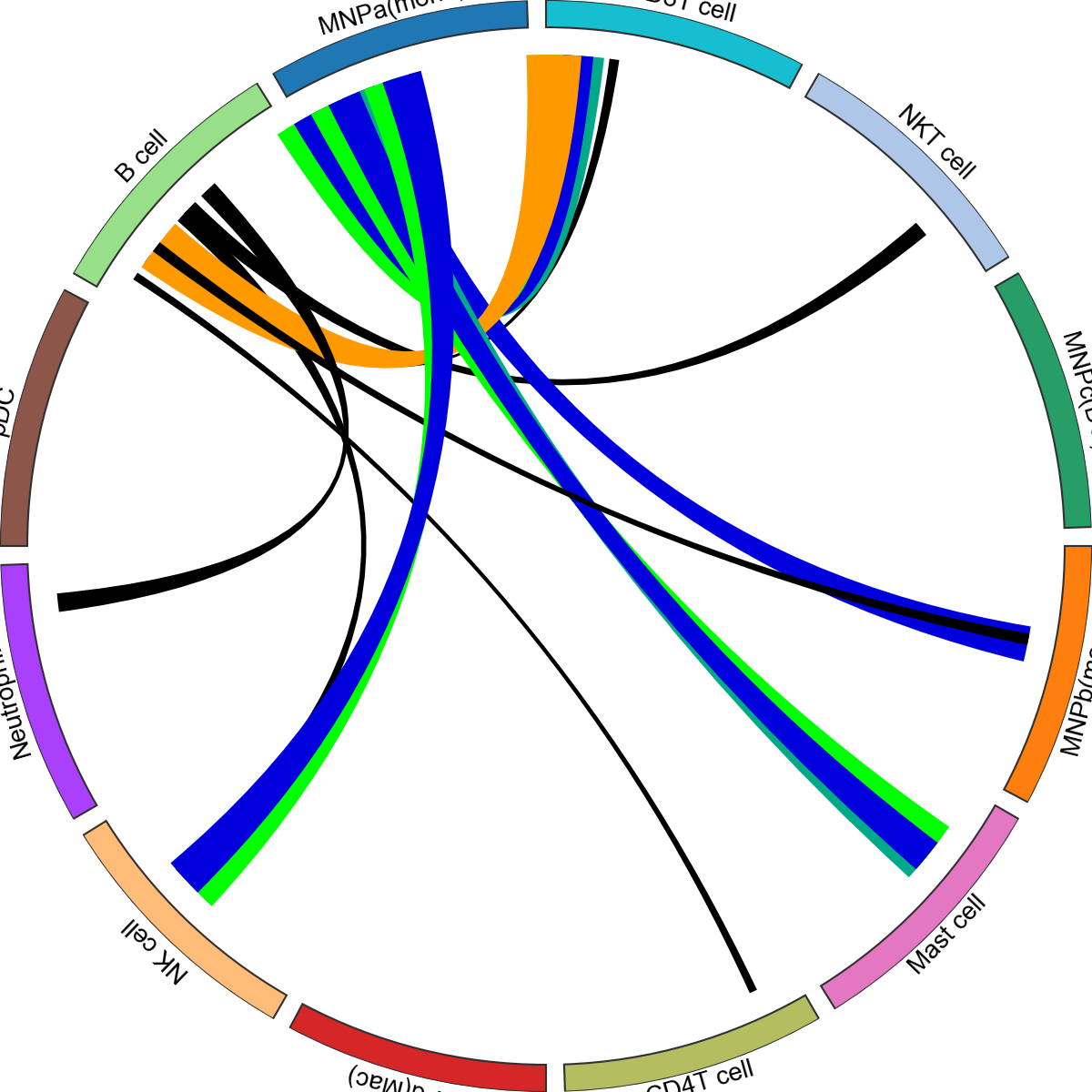
You can also just plot a specific interaction:
[15]:
kpy.plot_cpdb_chord(
    adata=adata,
    interaction="CLEC2D-KLRB1",
    keep_celltypes=["NKT cell", "Mast cell", "NK cell"],
    celltype_key="celltype",
    means=means,
    pvals=pvals,
    deconvoluted=decon,
    link_kwargs={"direction": 1, "allow_twist": False, "r1": 95, "r2": 90},
    sector_text_kwargs={"color": "black", "size": 12, "r": 105, "adjust_rotation": True},
    legend_kwargs={"loc": "center", "bbox_to_anchor": (1, 1), "fontsize": 8},
)
[15]:
<pycirclize.circos.Circos at 0x77580353e000>

You can also fix the sector size to be equal, although this will cause the links to be squished.
[16]:
kpy.plot_cpdb_chord(
    adata=adata,
    interaction="CLEC2D-KLRB1",
    keep_celltypes=["NKT cell", "Mast cell", "NK cell"],
    celltype_key="celltype",
    means=means,
    pvals=pvals,
    deconvoluted=decon,
    link_kwargs={"direction": 1, "allow_twist": False, "r1": 95, "r2": 90},
    sector_text_kwargs={"color": "black", "size": 12, "r": 105, "adjust_rotation": True},
    legend_kwargs={"loc": "center", "bbox_to_anchor": (1, 1), "fontsize": 8},
    equal_sector_size=True,
)
[16]:
<pycirclize.circos.Circos at 0x775803388950>

Saving the plots
For plot_cpdb, because it’s written with plotnine, you need to save it as follows:
p = plot_cpdb(...)
p.save(...)
see also: https://plotnine.org/reference/ggplot.html#plotnine.ggplot.save
For plot_cpdb_chord, because it’s written with pyCirclize, you can save it as follows:
p = plot_cpdb_chord(...)
p.savefig(...)
see also: https://moshi4.github.io/pyCirclize/api-docs/circos/#pycirclize.circos.Circos.savefig
For other functions, you can use seaborn/matplotlib saving conventions e.g. plt.savefig
That’s it for now! Please check out the original ktplots R package if you are after other kinds of visualisations.
[ ]: